Are organisations reporting their gender pay gap data correctly? The Government Equalities Office has issued recommendations on how data should be reported, but independent statistician Nigel Marriott estimates that between 9% and 17% of gender pay gap data is wrong. He looks at the errors some employers made.
Gender pay gap reporting
Webinar: Closing the gender pay gap
Four ways of presenting your gender pay gap: which works best?
Three months on from the gender pay gap reporting deadline, the impact of entering data incorrectly can be devastating for an organisation, from harming its employer brand and reputation, increasing disengagement of employees and potentially leading to claims for discrimination.
As the Government Equalities Office recently pointed out, the public needs to have confidence in the results of the gender pay gap data supplied.
However, I estimate that at least 1,000 organisations have entered their data incorrectly, not intentionally but because of confusion about what data has to be entered. This has led to a number of common errors, outlined below.
1. Mathematical errors
 Two organisations say their gender pay gap is greater than +100%, which is impossible since it would mean women are actually paying their employer to work there.
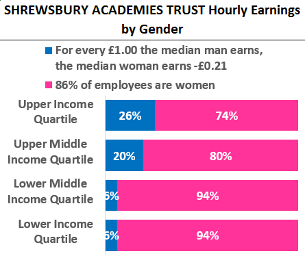
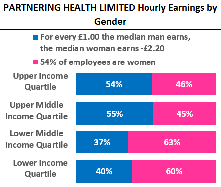
Shrewsbury Academies Trust (right) says when that women earn -21p for every £1 that men earn. Similarly, Partnering Health (below right) originally recorded -£2.20 less for every £1 that men earn, but has since updated its submission.
Since the convention is that a positive number means that median man earns more than the median woman, this means the median woman is earning 121% less than the median man in the first chart and 320% less in the second chart.
 But the maximum positive value the median gender pay gap can be has to be less than 100% – in other words, a situation where women are paid nothing, which obviously cannot happen.
2. Income quartiles entered the wrong way around
Quartiles are where an organisation is split into four equally sized chunks of employees based on their hourly earnings (including bonuses) and then the gender split is recorded.
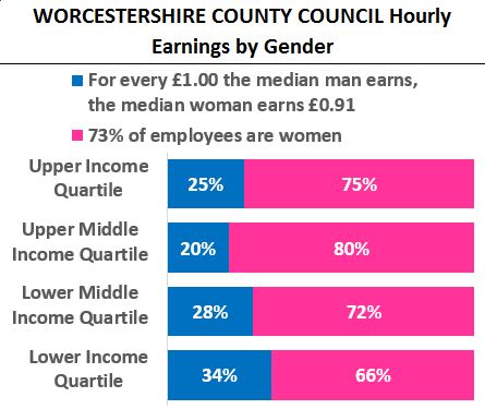
Quartiles, in my opinion, offer the most valuable insight into gender pay gap data – and they also provide a useful error check. Worcestershire County Council, for example, has recorded a median gender pay gap of +9%, which is similar to the national median.
Yet, based on their quartile data, it is possible that they should have recorded -9%, where the median woman is paid more than the median man.
 Suppose that 400 people work for the council. Using the quartile percentages from the chart, that means there are 293 women and 107 men working for the council. To find the median woman, the 293 women have to “stand in a line” in order of their hourly earnings. The 147th woman becomes the median, as does the 54th man.
Based on these calculations, the median woman would sit in the upper middle income quartile, whereas the median man would sit in the lower income quartile. Therefore the median man would be earning less than the median woman, and the reported gender pay gap data should be negative (as in, women earn more).
3. Claim of no pay gap conflicts with the male quartile gap
It is easy to see that if a company is reporting a positive median (not mean) gender pay gap, then this must imply that the sum of the percentage of men in the upper and upper middle quartiles should be greater than the sum of the male percentages in the other two quartiles.
The below calculations provide a quick sanity check to figure out if there is an error.
Calculate the male quartile gap as the sum of the male percentages in the upper and upper middle income quartile. Then subtract the sum of the male percentages in the lower and lower middle income quartiles.
 If the median gender pay gap is positive then the male quartile gap must be positive. If the median gender pay gap is negative, then the male quartile gap should also be negative.
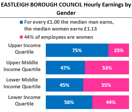
If this check is violated then an error has been made. For example, Eastleigh Borough Council claims a negative median gender pay gap of -13%, which means the inequality 75% + 47% – 45% – 56% < 0% should be true, but this clearly isn’t the case.
Some 937 organisations are reporting a median gender pay gap of zero. However, this can only be correct if the male quartile gap is virtually zero.
Of these, 374 organisations have male quartile gaps between -5% and +5% so they could be correct but their data should still be checked. That still leaves 564 organisations that must have made a mistake.
How many organisations are making these errors?
Based on the comparison of the reported median gender pay gap versus the calculated male quartile gap, I estimate that 9% of organisations have definitely made an error. A further 8% may have made an error.
| Quartile inequality vs median gender pay gap |
Reported median gender pay gap | Total | |||
| favours women | is zero | favours men | |||
| Quartile gap | Correct | 1,232 | 49 | 7,470 | 8,751 |
| Possible error | 118 | 325 | 384 | 827 | |
| Definite error | 122 | 563 | 241 | 926 | |
| Total | 1,472 | 937 | 8,095 | 10,504 | |
Why the government’s guidance is wrong
These results are not surprising. The guidance on the government’s website is misleading on a number of points. They suggest that to find the median gender pay gap in hourly earnings, you should choose the hourly earnings that are in the “middle of the range”.
If hourly earnings range between £10 and £90 per hour, for a non-mathematical person it would be easy to interpret that the median hourly pay would be £50 per hour.
Check your data is correct
Gender pay gap data for 2017 and 2018 can be updated at any time.
Marriott Statistical Consulting has produced a spreadsheet that includes all data for all organisations and a statistical review of the data provided. This is a free tool that is available to download with no registration required.
But there is no guarantee that this is right as the earnings of the median woman is the one who is in middle of the line if every woman was lined up according to their hourly earnings.
So before we all get caught up in debating how to best portray gender pay gap data, there needs to be a thorough check and review of the data submitted. Companies can do this themselves, if necessary training their teams on the mathematics involved.
Sign up to our weekly round-up of HR news and guidance
Receive the Personnel Today Direct e-newsletter every Wednesday
Equally, the government should issue better guidance and implement sanity checks on their website that would prevent mathematically impossible data from being entered in the first place.
Gender pay gaps shown are based on median hourly earnings. Charts prepared by Nigel Marriott, Independent Statistician. All data sourced from the government’s Gender Pay Gap Service.
