Over recent years HR has been hit by a deluge of data. Here, Will Sheldon looks at how insights into the organisation and workforce have evolved with five examples of org charts from the past 200 years.
The complexity and speed at which organisations develop is greater than ever and many HR professionals are struggling to keep up. However, the pursuit of simplicity and clarity regarding workforce decisions is not unique to our time and neither is the solution.
Throughout the history of organisations, some form of visualisation has been used to track how many people are employed, what they are doing and where they are doing it.
So what can we learn from these diagrams and how are they relevant today? Here are five org charts from the past and five trends that they represent.
Trend 1: Visualising to analyse and understand
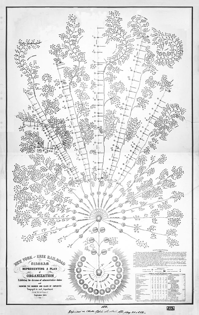
Organisational diagram of the New York and Erie Railroad, 1855. Image: Wikimedia Commons
Dating from the mid-1800s, this org chart is widely reported to be the first of its kind (McKinsey Quaterly, 2013).
It was designed by the Erie Railway Company’s general manager Daniel McCallum. It demonstrates how powerful visualisations can be in communicating large amounts of information.
The interesting twist with this org chart is that it starts with the board of directors at the bottom (most diagrams work from the top down) – perhaps this is a healthy perspective that more directors and managers could consider today?
Trend 2: Using nature as a source of inspiration

Queen Victoria and Prince Albert: The Genealogical Tree. Image: Wikimedia Commons
Our second chart, like the first, is a very organic perspective of the organisation. In this case it is more of a family tree, but the Royal Family is one of the oldest organisations in the country.
This chart, created in 1897 to mark Queen Victoria’s Diamond Jubilee, captures the “natural” inspiration behind the language of charts.
The relation of leaves, branches and roots will speak to modern day developers, designers, artists and business people alike.
Trend 3: Connecting the organisational system

Organisational chart for editions of Kino-korrespondent Image: Dziga Vertov Collection, Austrian Film Museum, Vienna.
As our understanding of the organisation from a systems perspective and our ability to think about different functions have developed, so have the charts we use.
Moving on to 1922, this image above explains how the Soviet film maker Dziga Vertov organised his film crew for his Kino Korrespondent films.
The crew is at the centre, and coming out from there in concentric lines are the activities related to the filming – for example, editing or recording.
It captures a large amount of information in a simple image, and starts to communicate a shift in thinking from a simple people perspective, to a systems approach, connecting people to activities and information from across an organisation.
Trend 4: Combining design with analytics
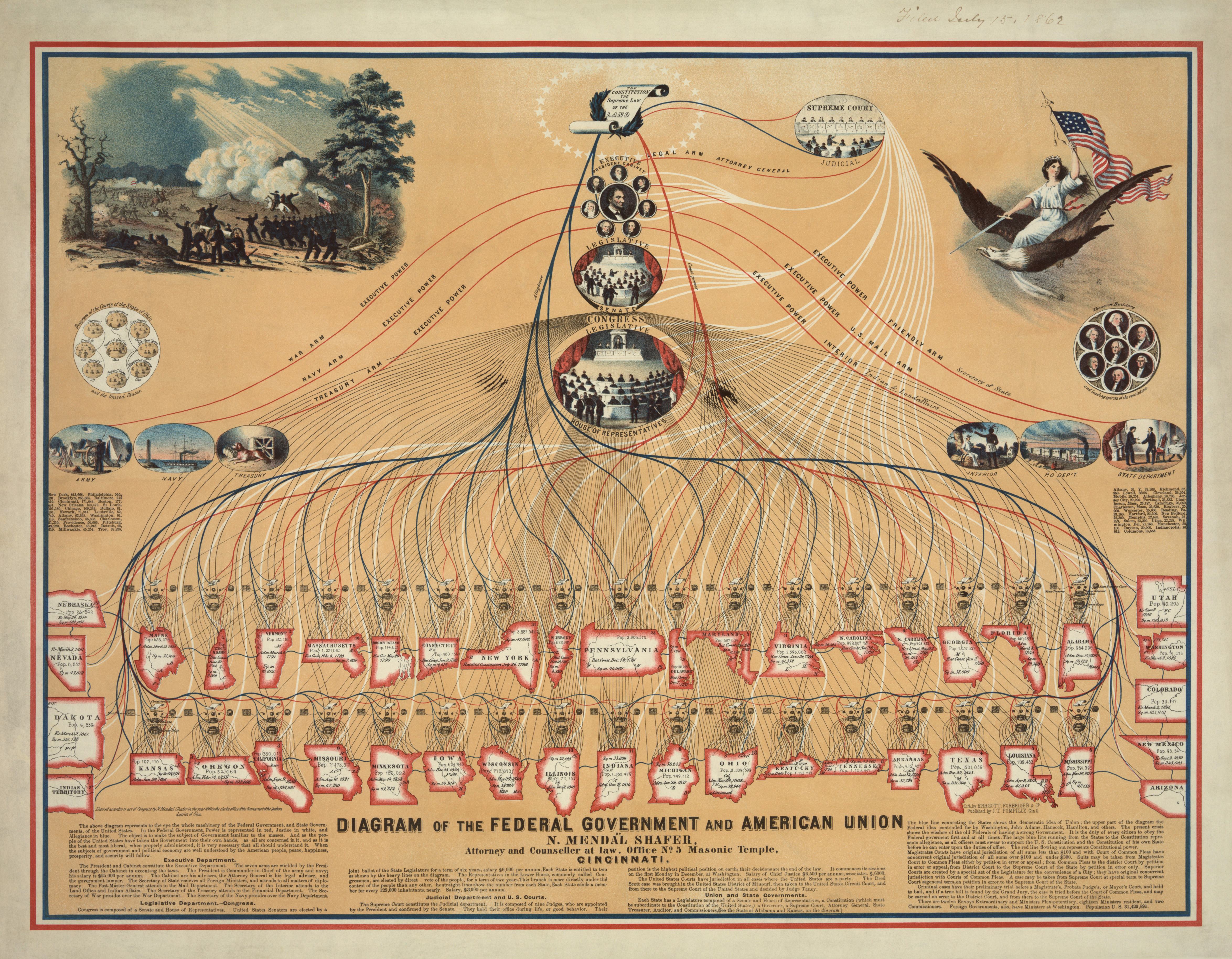
Diagram of the Federal Government and American Union. Image: Wikimedia Commons
Analytics may be regarded as scientific and fact based, but the struggle of dealing with more and more data and having to communicate that data effectively has driven us to think a lot harder about how to clearly represent information in an clear and engaging way.
This is where analytics and design intersect to create infographics. How can you make complex information simple and easy to understand?
This diagram of the connections and structure of America’s federal government is a great example, combining the use of colour, shapes, text, and illustrations to engage the viewer and convey a large amount of information at once.
Trend 5: Connecting visualisations to data

An example of an OrgVue “sunburst” chart
The challenge that all organisations face is that they are not static. Organisational data, once on a page is just a snap shot in time, not a true reflection of an ever-changing workforce.
Advancing technology has allowed visuals to be connected directly to data, making them interactive, malleable and editable. This image represents an organisation of 1,500 staff with colours representing engagement levels.
However, the real breakthrough is not that visuals are connected to data, but data is connected to visuals (such as in the OrgVue chart, above). This means that while updating data alters a visualisation, equally manipulating visuals updates the very data it represents.
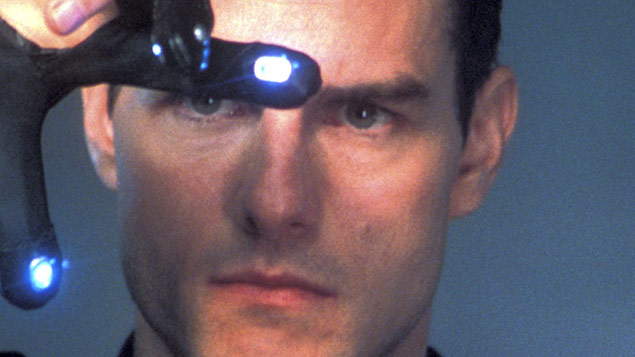
This is changing the way we consume and interact with not just workforce analytics but any data. Dragging and dropping data and visuals like Tom Cruise from Minority Report is increasingly becoming a reality in data analytics
Sign up to our weekly round-up of HR news and guidance
Receive the Personnel Today Direct e-newsletter every Wednesday
The conclusion? Complexity is nothing new. There will always be a continuous battle between complexity, simplicity and understanding. However, what this does show is that new thinking and technology helps us see and understand the world in new ways.
The question is whether or not you can move quickly enough to embrace it, improve decision making and give your organisation an edge when it comes to future workforce decisions.